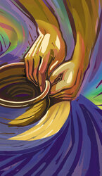
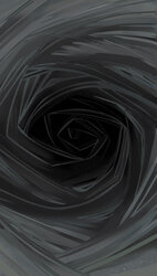
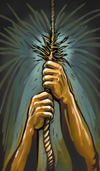
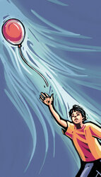
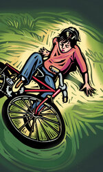
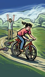
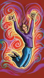
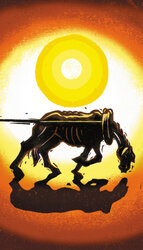
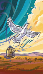
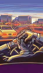
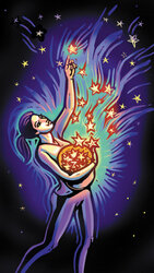
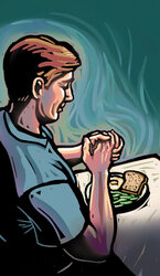
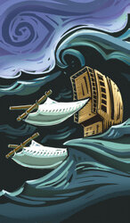
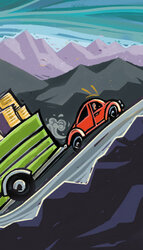
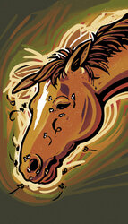
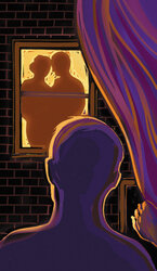
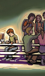
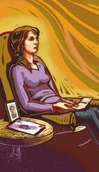
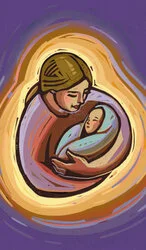
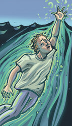
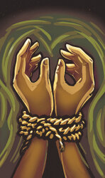
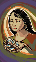
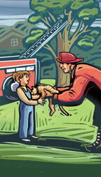
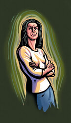
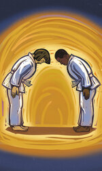
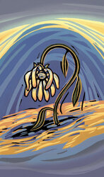
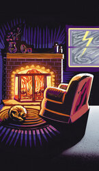
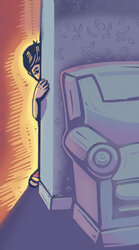
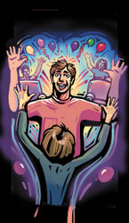
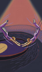
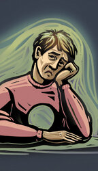
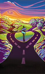
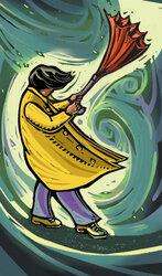
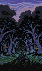
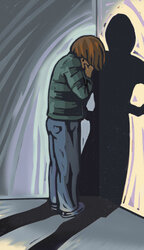
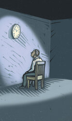
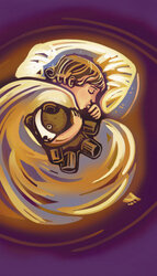
These images were born at the dining room table of my (Petra’s) home in Seattle. My talented and creative friends Tony Nahra, Rand Babcock, Peggy Foerch, and I brainstormed each one. “What does grief look like?” I’d ask. Then we’d sit in silence, writing down the images that came to mind. When we shared them, it sometimes sparked new ideas, and we continued to brainstorm until I felt we had one or more strong images to choose from for each emotion.
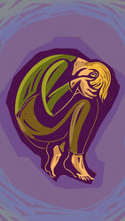
Verbally, I communicated these image ideas to the very talented and creative Kris Wiltse. “Grief,” I’d say, “Looks like someone in a fetal position.” Kris created a sketch of my description, and then showed it to me. Here’s the sketch she created of Grief:
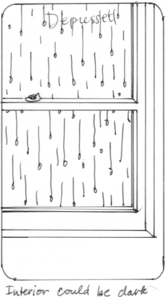
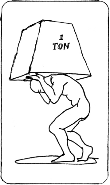
That sketch was perfect, so I gave it a thumbs-up (see the final version below) and Kris began to carve a linoleum block. But sometimes, when Kris created sketches of our ideas, I realized they wouldn’t work, and we had to implement another idea instead. Here are the first roughs for Depressed, Guilty, Hateful, and Unsure, for example, none of which made it into the deck:
Depressed attempt 1
Hateful attempt 1
Depressed attempt 1
Unsure attempt 1
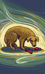
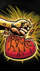
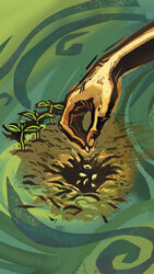
My goal was to evoke–rather than depict–emotions wherever possible. But what fulfills, scares, or confuses us is so unique to each individual that it would’ve been impossible to find an image that would evoke the same feeling in everyone. So in those cases, I chose a more symbolic/conceptual image instead.
It was an absolute privilege to brainstorm these images with Tony, Rand, and Peggy and a dream come true to have someone as talented as Kris turn them into such beautiful works of art. For more information about how Kris created the illustrations, see this article: Carving in Color.
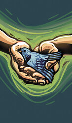
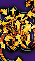
Following are thumbnails of the illustrations on the deck’s 60 emotion cards (the instructional and blank cards aren’t depicted here).


